Magazine Advertisement
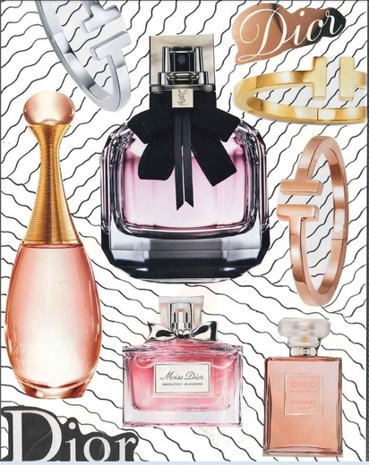
`This is a magazine ad for fragrances by Dior. It was created by using clippings from previous ads in magazines. Using multiple different ads, I collected the pieces i wanted in my ad. I included many elements and principles of art into my ad, including line, color, balance, space, and emphasis. The perfume bottle in the middle is my main product that I am advertising. All of the other pieces surround the main product and show the different perfumes that Dior makes. By adding lines in the back, it fills up the extra space in between the magazine clippings. While completing this project, I learned about thinking more creatively and thinking about the elements and principles in all of my work.
Windshield Flyer #1
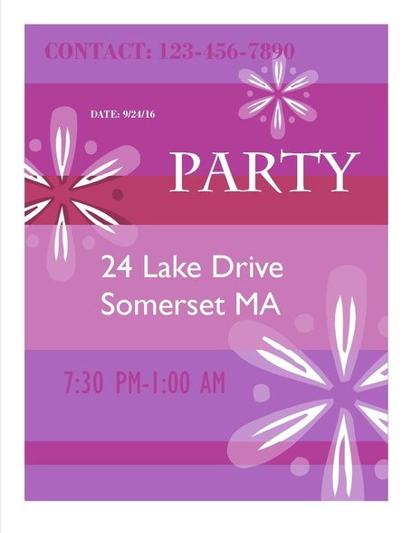
This assignment was to complete a windshield flyer that you would put on a car windshield to advertise an event, sale, concert, etc. Flyer 1 was to be made on Microsoft Publisher (2010) to promote something, while using a flyer template. I created a party flyer that included both elements and principles of design, including balance and color. All of the information is included on the flyer (who, what, where, when, why and how) as well as clear, readable font/text and high quality images. During this assignment, I learned about using a template on Microsoft Publisher.
Windshield Flyer #2
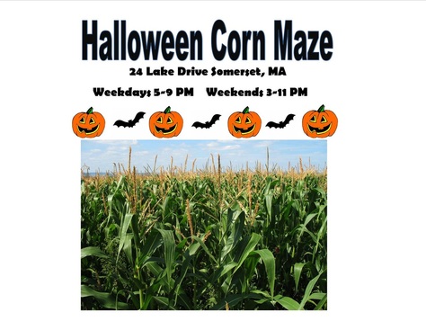
For the next windshield flyer, we had to complete a Halloween -themed in the landscape format. This flyer also includes the elements and principles of design including color and emphasis. This flyer was not created with a template, but still put together as a flyer. the necessary information is included(who, what, where, when, why and how) and the text/image quality is good. I learned more functions on Microsoft Publisher.
Windshield Flyer #3
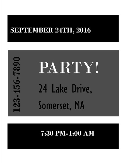
For the last windshield flyer, we had to recreate and redesign a previous flyer and make it in black and white. I redesigned my first windshield flyer, because I could recreate this one easier by using the same template and changing the color scheme. Although the element of color is gone, there are still elements and principles of design included, such as line, balance, and space. The necessary information stayed the same, so it is still included in this flyer (who, what, where, when, why and how) and the image and text quality is good. All three of these windshield flyers helped me learn about and familiarize with Microsoft Publisher.
Brochure
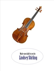
Greeting Card |
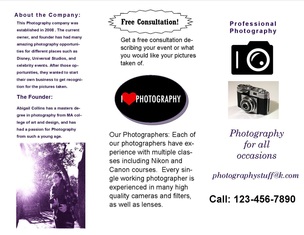
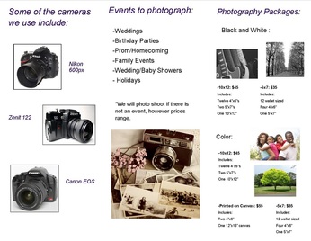
This assignment was to create a brochure about a company, event, etc. using Microsoft Publisher. I created a brochure for a photography company that I made up. During this assignment, I used Microsoft Publisher and Photoshop. Photoshop was used to edit the photo of myself. During this, I used Publisher and made a brochure that has both clear pictures and text. I learned how to do multiple functions of Photoshop to edit pictures, and I continued to become more familiar with Microsoft Publisher.
|
|
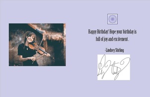
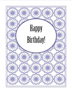
This assignment was to create a greeting card on Microsoft Publisher and edit photos on photo shop. We had to make 5 edits on the picture that you chose. In my picture, I changed the brightness and contrast of the photo, added the graphic pen filetr, changed the color properties to "sienna blue", changed the saturation, and then added the grain filter to the photo. This assignment helped me learn more about using photo shop and its qualities.
|
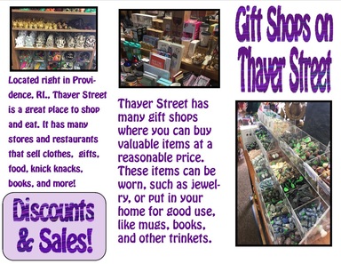
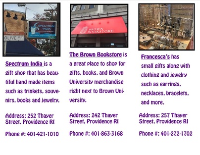
Thayer Street Brochure
|
For this assignment, we had to create a brochure for Thayer street, using specific stores that you could buy gifts on. I didn't go on the field trip, but I used the images that were taken by the people in my group. I edited my word art on Photoshop by saving the word art as an image and then drawing on it with the draw tool and inserted it into my flyer. I also edited the photos on the flyer on Photoshop. I cropped the images, added some brightness to the photos that were too dark, and added borders to the images to help them stand out. The flyer was used with Microsoft Publisher. I learned about editing pictures in Photoshop as well as editing word art.
|
